
I am asked often about how I create these Polaroid Style blog cards which I have used on my sites for years, and I often use in themes. Frankly, it’s really quite easy.
I’m going to show you how in this tutorial.
It’s worth noting, the aspect ratio of the blog cards is different than a Polaroid picture. There is more white space under the title and meta, and the image is more rectangular than it is square.
This is for two reasons:
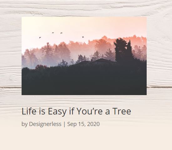
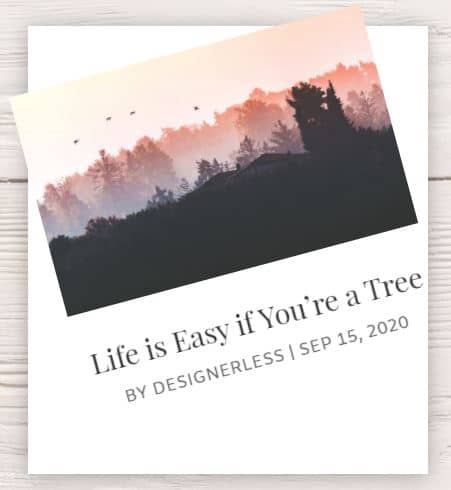
One: We need the white space under the title and meta to allow for content spillage. If you have an especially long title, it will run over into the extra white space. See what I mean in this screenshot.
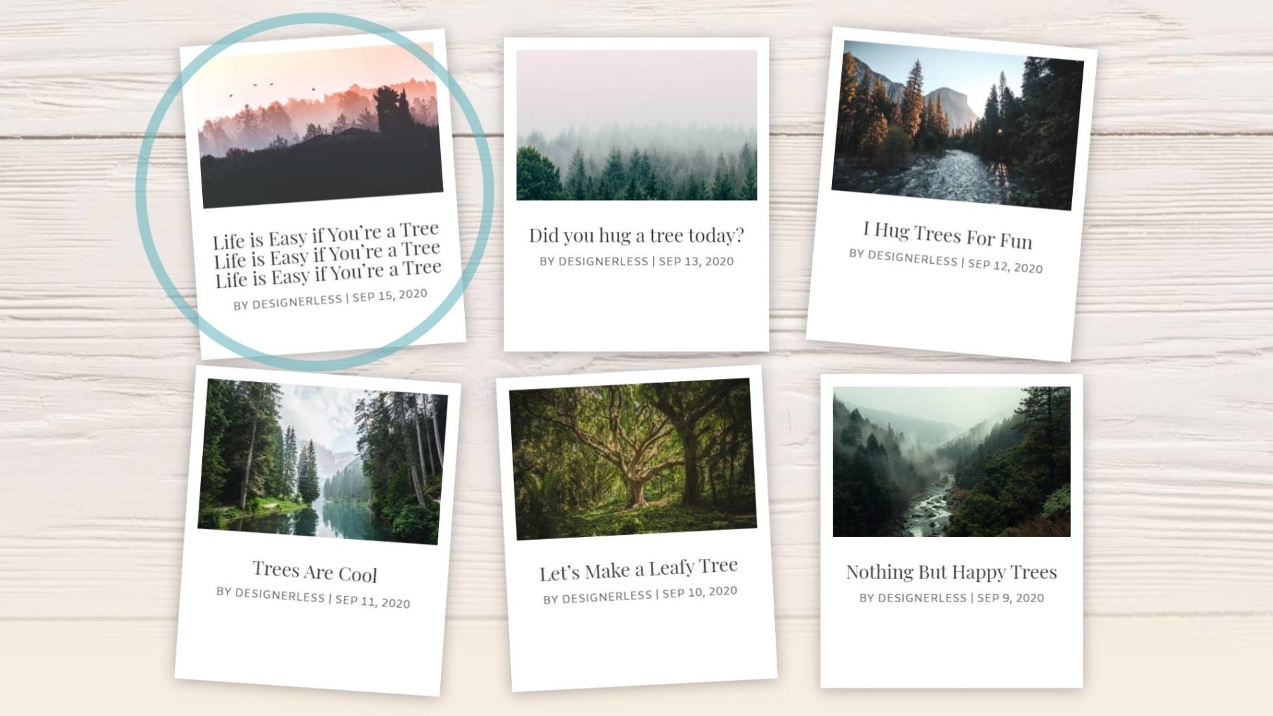
Even with all those extra characters in the first blog card’s title, the text doesn’t spill out of the white border.
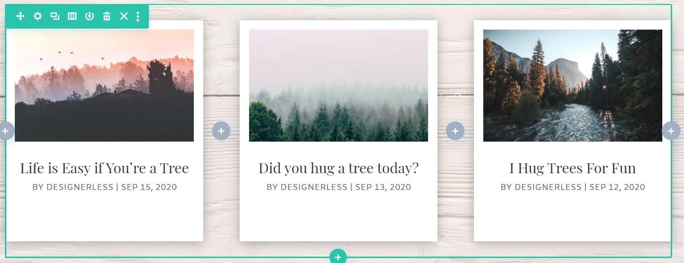
Two: The other reason the blog cards aren’t an exact replica for Polaroid images is because Divi controls the aspect ratio of your blog images.
The photo in the top middle is actually a vertical image, yet you’d never know because of the way Divi presents it. Yes, you can modify the aspect ratios of the featured images in WordPress and Divi, but that’s a much longer tutorial, and frankly, it can make your site look like shit if you’re not careful.
So as long as you’re cool with the horizontal blog images, this tutorial will work great.
There is something else you should know before we dive in:
The blog cards which are tilted askew like this work best on desktop. For usability and accessibility reasons, I strongly encourage you to keep the blog cards straight and aligned for tablet and mobile. (I’ll show you how to do this.)
I tested the askew blog cards extensively on tablet and mobile and it doesn’t work nearly as well.
The user experience for those two devices goes down significantly, and above all else, we want your visitors to be able to use your site intuitively.
•••
What you’ll need for this tutorial:
- WordPress + Divi 4.5. (If you don’t have Divi, get it here.*)
- At least six blog posts with featured images.
- A smart phone and a tablet to test the responsive options. (Or alternative; see below.)
You may be thinking, “But Divi lets me preview the site in different devices from Visual Builder.”
And yes, this is technically true, but it doesn’t always work right, and you might be left thinking your design looks like crap on iPad and so you change something only, turns out, it actually looked good to begin with.
If you do not have a smart phone and/or a tablet, do not despair!
The website LambdaTest* will help you test your designs across multiple browsers for both desktop and mobile.
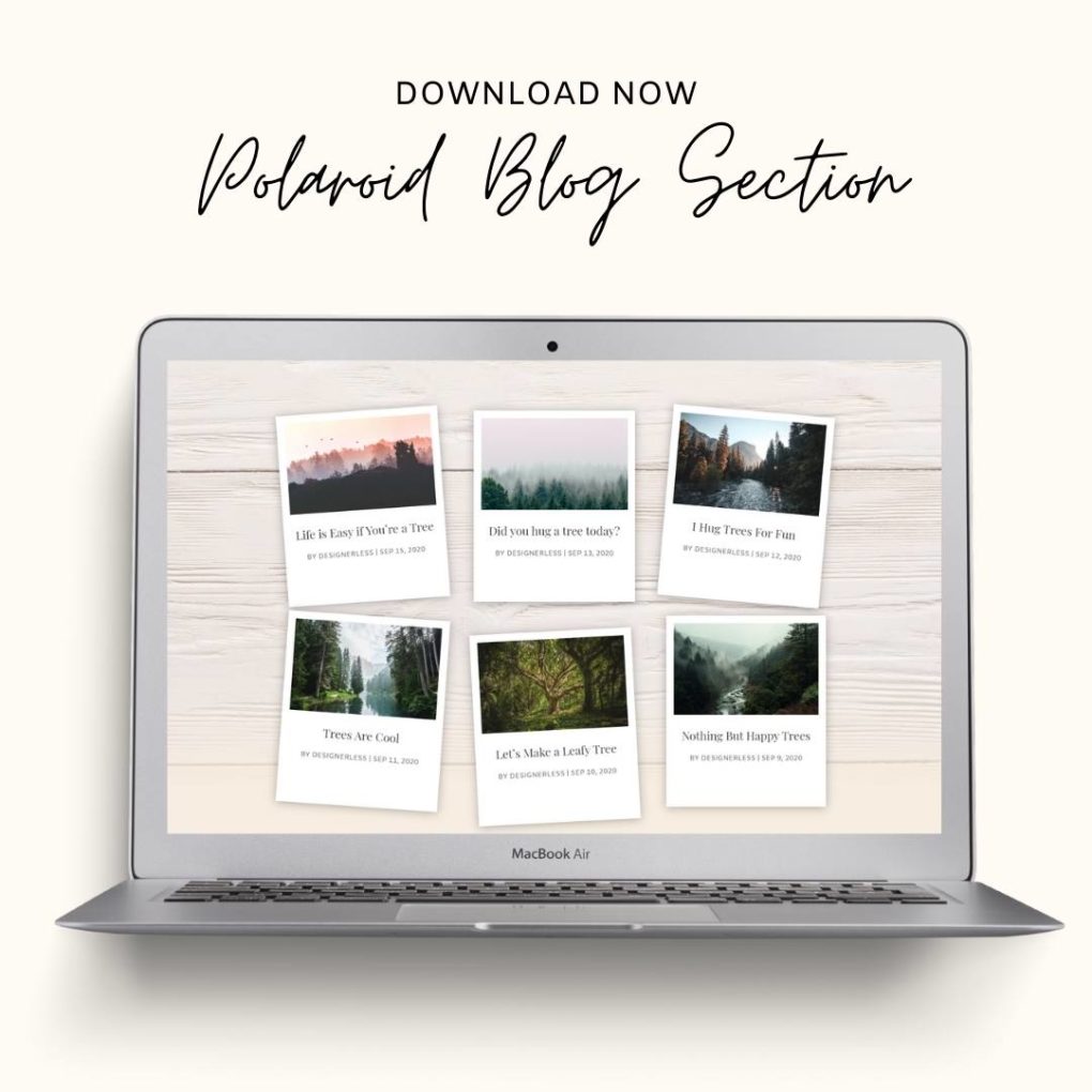
Without any further ado, let’s get started. Scroll down to begin the tutorial. (Or, you can skip all the work and just buy the section out of my shop for $1.)
•••
How to Create Polaroid Blog Cards in Divi 4.5
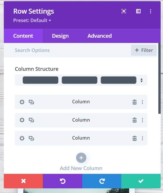
Step 1: Create a new section with a 3 column row.
Step 2: Define a section background image and gradient.
I wanted these images to look like they’re on top of a table, so I used a wood plank background.
This image is from the Header Pack for a new theme I’m developing. You can save it right to your computer and upload into Divi.
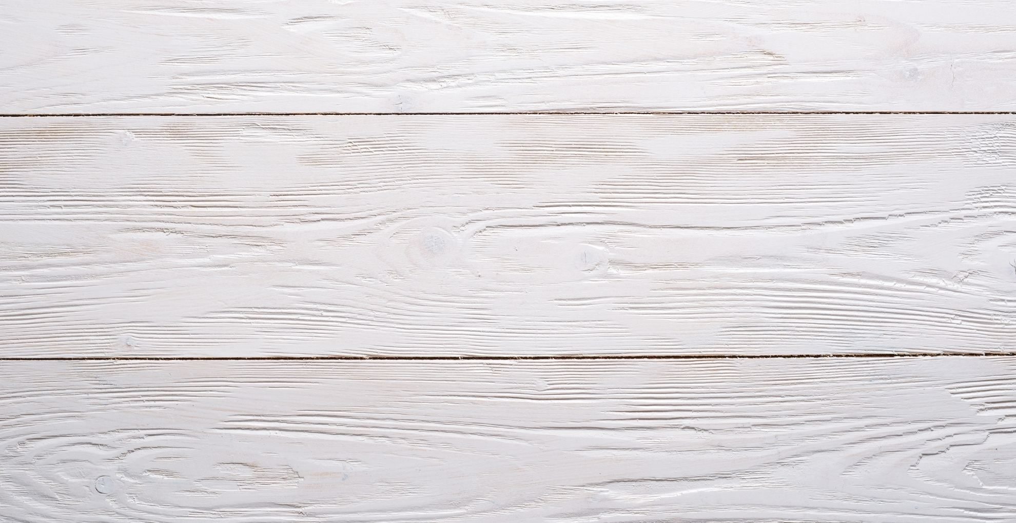
Take the image you just downloaded, and set it as the background image in your section.
The gradient is optional. I am using a gradient because the bottom of the section flows into another section, but you do as you wish.
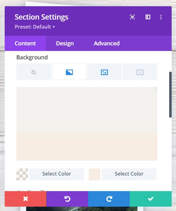
If you want to use a gradient, click the gradient icon in the section background settings (second icon from the left). You’ll see a screen that looks like this.
The gradient settings are:
Box 1: rgba(247,237,226,0.46)
Box 2: #f7ede2
Gradient Type: Linear
Gradient Direction: 180%
Start Position: 54%
End Position: 72%
Place Gradient Above Background Image: Yes
Now your section should look like this.
Step 3: Create Your First Blog Module
Next, we’re going to create and style your first blog module. This blog module is going to serve as the foundation for all the other blog modules we create in this tutorial.
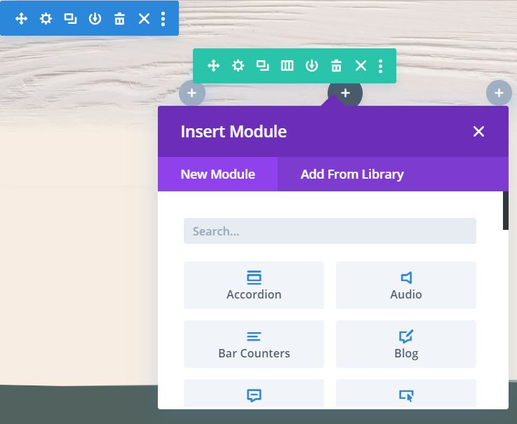
Click the first grey plus sign on the left, and then select “Blog.”
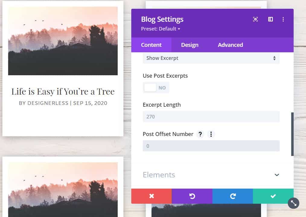
Next, configure the blog module with the following settings:
Post Count: 1
Categories: Up to you.
Use Post Excerpts: Toggle to “No.”
Post Offset Number: 0
Elements:
- Toggle “Show Categories” to off.
- Toggle “Show Excerpt” to off.
- Toggle “Pagination” to off.
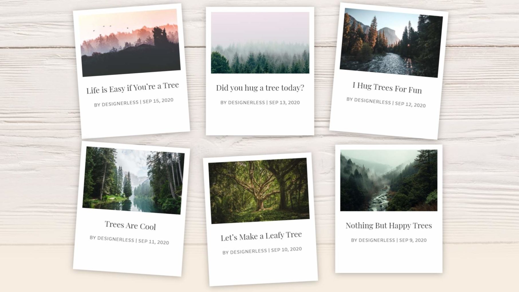
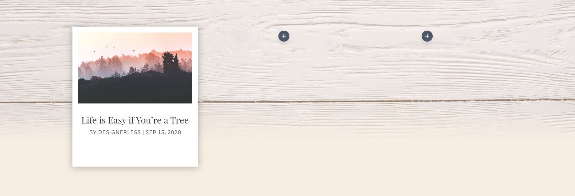
At this point, your blog module should look something like this image.
Step 4: Style Your First Blog Module
On the content tab of the blog module settings, scroll down to the bottom to Background, and set the background to white. #FFFFFF.
Then click to the Design tab, and change the following settings.
Title Text
Title Text Font: Playfair Display
Title Text Alignment: Center
Meta Text
Meta Font: Amiko
Meta Font Style: TT
Meta Font Alignment: Center
Meta Font Size: 14px
Spacing
Padding: top, bottom, left, right: 15px.
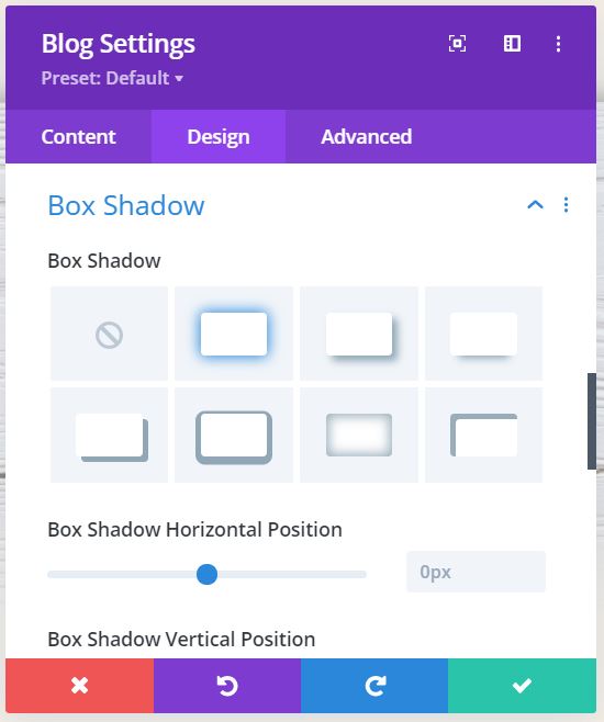
Box Shadow
Select the top row, second option from the left.
At this point, your section should look like this.
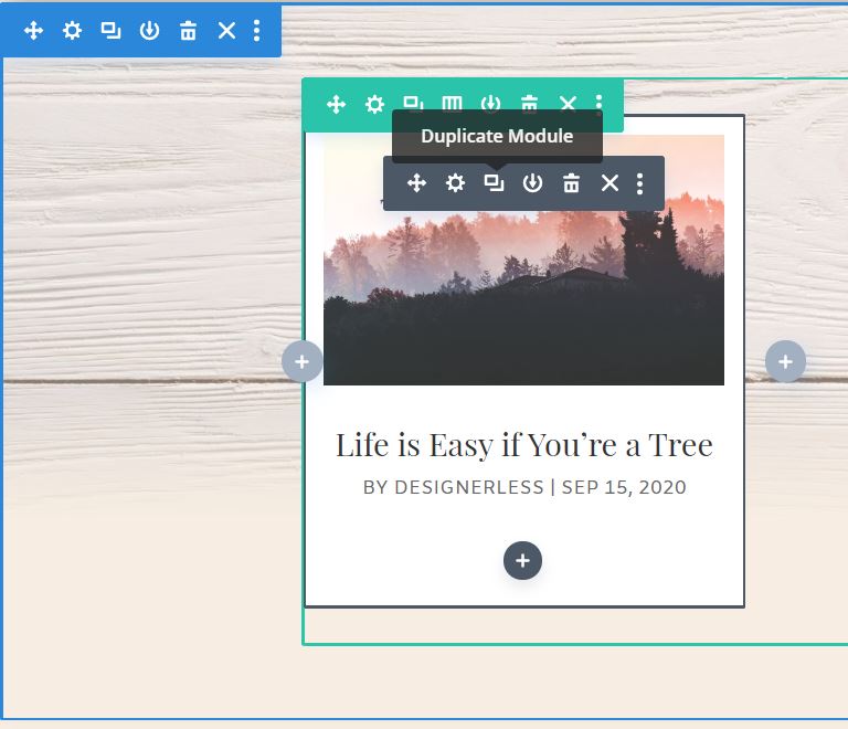
Step 5: Duplicate the module.
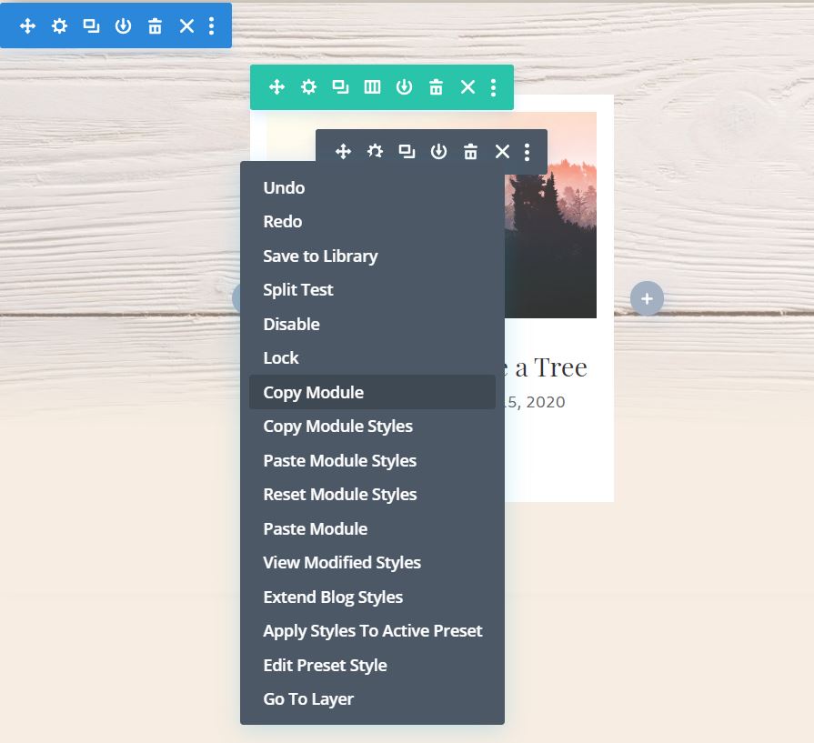
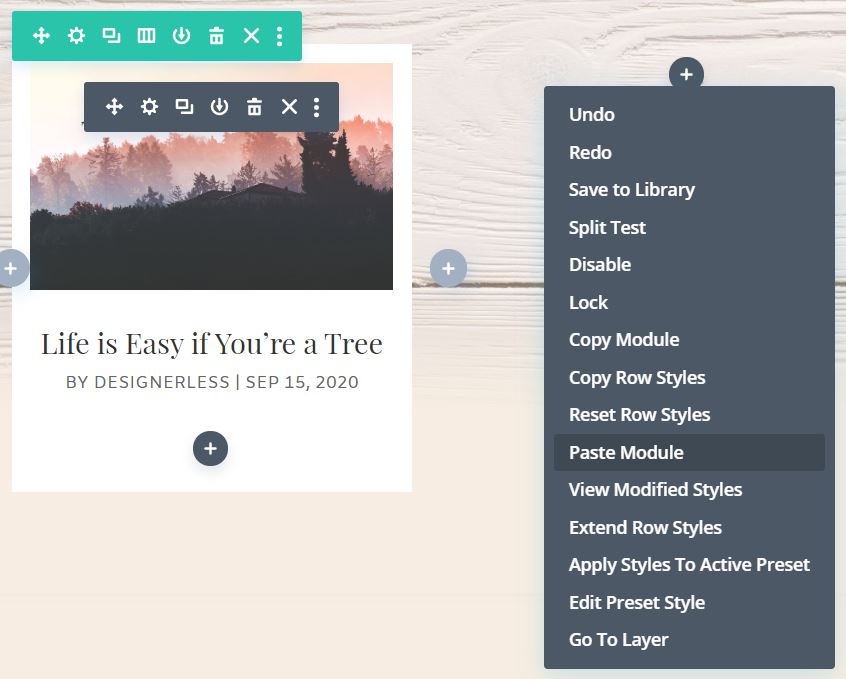
Now duplicate the module. You can do this by clicking the “duplicate” icon, and then drag the new module to the correct column like in this screenshot.
Or you can right click the gear, and then select “Copy Module” and then right click on the plus sign in the new column and click “Paste Module.”
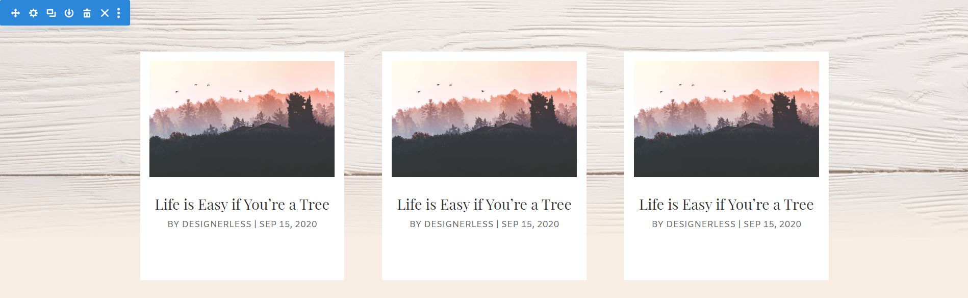
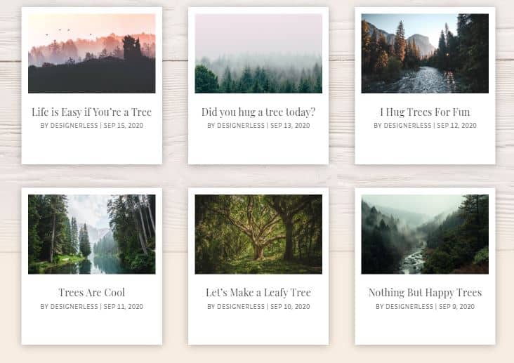
Your section should now look like this, with three identical modules all the way across.
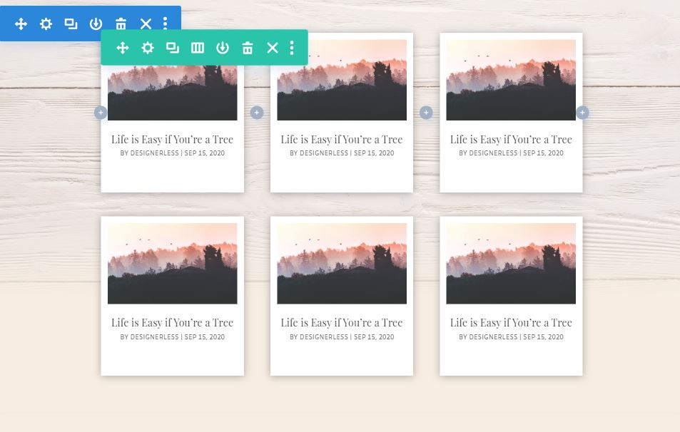
Duplicate the whole row. You’ll have a section with 2 rows, 3 module across.
Step 6: Adjust the post offset intervals.
Pagination is turned off because this design doesn’t work well with pagination on, so to make sure the blog modules don’t all show the same post, we need to adjust the post offset.
Click the gear icon for your second module, and scroll down til you see Post Offset Number. It’s in the first section of the settings window.
Change the Post Offset to 1, then click the green check button to accept the changes.
Open up the third blog module (top row, far right), and change the interval to 2. Then click the green check button to accept the changes.
On the second row, the offset for the first blog module is 3. The second module’s offset is 4, and the third module’s offset is 5.
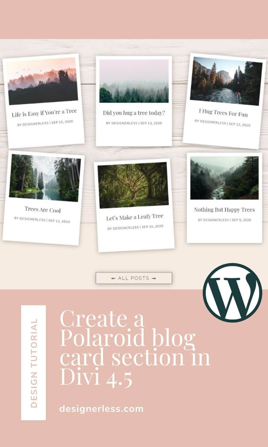
Your section should now look like this.
If you’re pleased, go ahead and send your changes live, and you’re all set!
If you want to tilt the modules so they’re askew like Polaroid pictures on a table, then you need to follow the next two steps.
Step 7: Duplicate the section.
The tilted blog cards don’t work well on phones or tablets and it creates a usability issue, so you need two sections. One with the cards straight (for phone and tablet) and one with the cards tilted (for desktop).
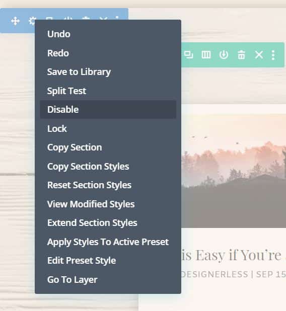
Duplicate the entire section, and disable that section on desktop. An icon that’s red means it’s disabled on that size screen.
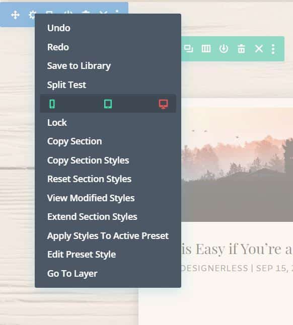
Go back up to the original section, and disable that section on phones and tablets.
Step 8: Tilt your columns.
To rotate the blog modules, we’re actually going to rotate the columns themselves. If we only rotate the blog modules, the background and box shadow doesn’t tilt with it, and we end up with a blog module that looks like this.
So to ensure that doesn’t happen, we instead rotate the column.
Open up the row settings by clicking the gear on the green menu bar.
Now you’ll see all the settings for the row. Click the gear next to the first column to enter the settings for that column.
Go to the Design tab, and then scroll down to the section that says “Transform.”
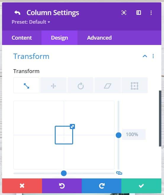
Click the 3rd icon from the left, and you’ll enter the rotation settings. Use the first circle to adjust the rotation of the column. You only need to adjust by a couple degrees up or down to tilt the card.
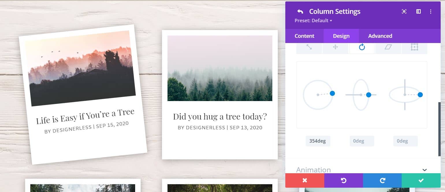
Repeat this step for the rest of the columns in this row, and the row below.
Then send your work public!
Viola!
Let me know how it goes, and make sure to post your link below so I can see it. 🙂
If you want to save yourself some time, you can buy this layout from my shop for $1. The layout comes with both the desktop and mobile versions. Click here to get it now.
I purchased the “save time” option to download this, but did not receive the product. I then sent an email to the support email with no reply. Please check for an email from me. Thank you
Hi! So sorry about the delay. I don’t know what happened, but I haven’t seen your email. I manually updated your access for you. There’s a direct download link to a zip, and a Dropbox folder. You should have access to both. I’m so so sorry about this. 🙁
I paid for this section, but my download section in my account is empty.
Hi! So sorry about the delay. I don’t know what happened. I manually updated it for you. I’m so so sorry about this. 🙁