
Hey guys. It’s been a while since I’ve had a new Divi post for you. 2020 has been really weird for me.
But, I wanted to pop in and share with you the brand new sticky options in Divi because, OMG, they’re so freakin’ cool. I am so stoked about this update I don’t even have words. As soon as I started playing around with the update, I started doing a happy baby clap behind my desk.
One of the biggest — and most frustrating — parts of Divi for me has been just how annoying it is to make something sticky, but now all that frustration is gone.
What does “sticky” mean?
When it comes to web design, “sticky” basically means something doesn’t move while all the other stuff keeps moving.
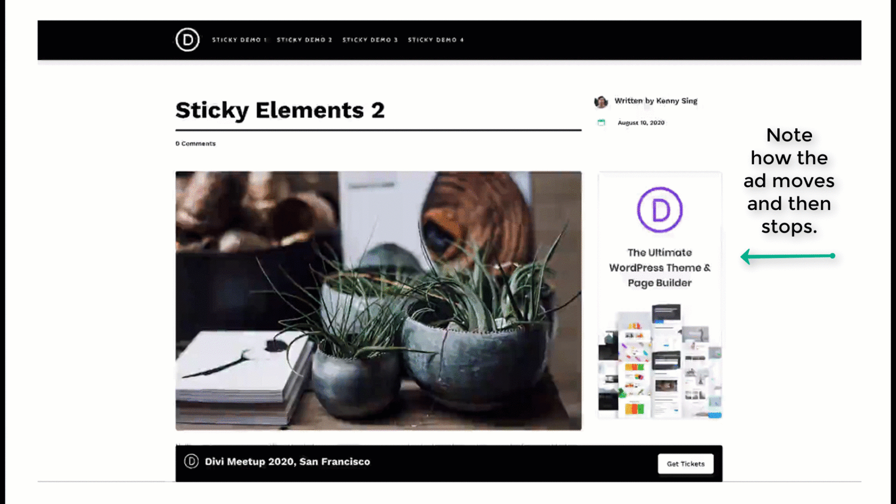
Here’s a demo below. Pay attention to the ad on the side.
The ad sticks once the visitor scrolls down far enough.
Why would you want to make something sticky?
Depending on what elements you make sticky, stickiness is good for usability — user experience — or conversions.
In the example above, stickiness is used to draw your attention to that ad. The ad scrolls, but then it stops. Your brain notices that. This subtle change makes the ad much more obvious, and this is good for your conversion rate.
But what about usability?
Having a fixed (or sticky) menu bar on your website makes your site much easier to use and get around. Your user doesn’t have to scroll up to the top to get to the menu.
The reason I am so excited about sticky options is because when Divi came out with the Theme Builder framework it became more annoying to create a fixed header. In old Divi, you’d make your navigation fixed simply by switching a toggle.
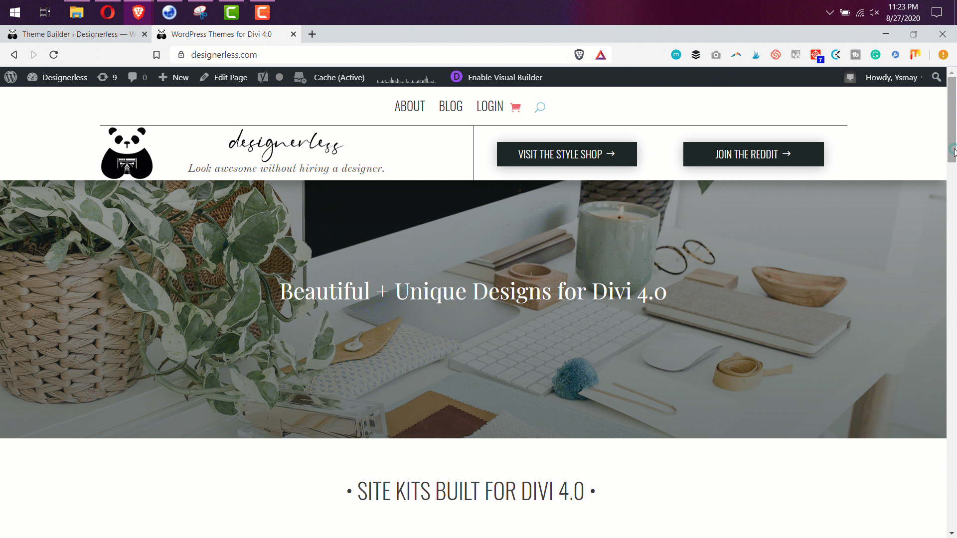
But when Theme Builder came out, the built in Divi navigation bar became pretty useless as the Theme Builder is just sooooo robust. The header for this site is custom designed in the Divi Theme Builder. And for months I’ve wanted to make it fixed, but it’s been too annoying to make it work perfectly across all browsers.
But this is all changed now thanks to the Divi Sticky Options.
How to Use Stickiness in Divi
Like most things the developers do here with Divi, stickiness is super easy to use.
Inside any section, row, or module, go to: Advanced > Scroll Effects > Sticky Position. There you have a number of options:
Stick to Top: This sticks your element to the top of the screen. This is what you’d want to use to make a sticky header. Once the element hits the top of the screen, it’s going to stay there.
Stick to Bottom: This sticks the element to the bottom of the screen. This is perfect for making CTA (call to action) boxes that are stuck to the bottom and then expand once the user scrolls down far enough.
Stick to Top and Bottom: The best of both worlds, this option sticks the element to the top or the bottom, based on how the user is scrolling. It sticks to the bottom as you scroll up, and it sticks to the top as you scroll down.
See exactly how easy it is to make your theme builder header sticky in the gif below. If all you want to do is make your header sticky, just follow this 30 second screen recording. (Watch on YouTube)
Advanced Sticky Features
Since you can make any section, row, or module sticky, you aren’t limited to only making the very top header sticky. You can have a menu bar lower on the page that turns into a sticky menu bar at the top of the site once the user scrolls.
Let’s look at the theme I’ve been building called Margot (available for purchase on September 1st 2020).
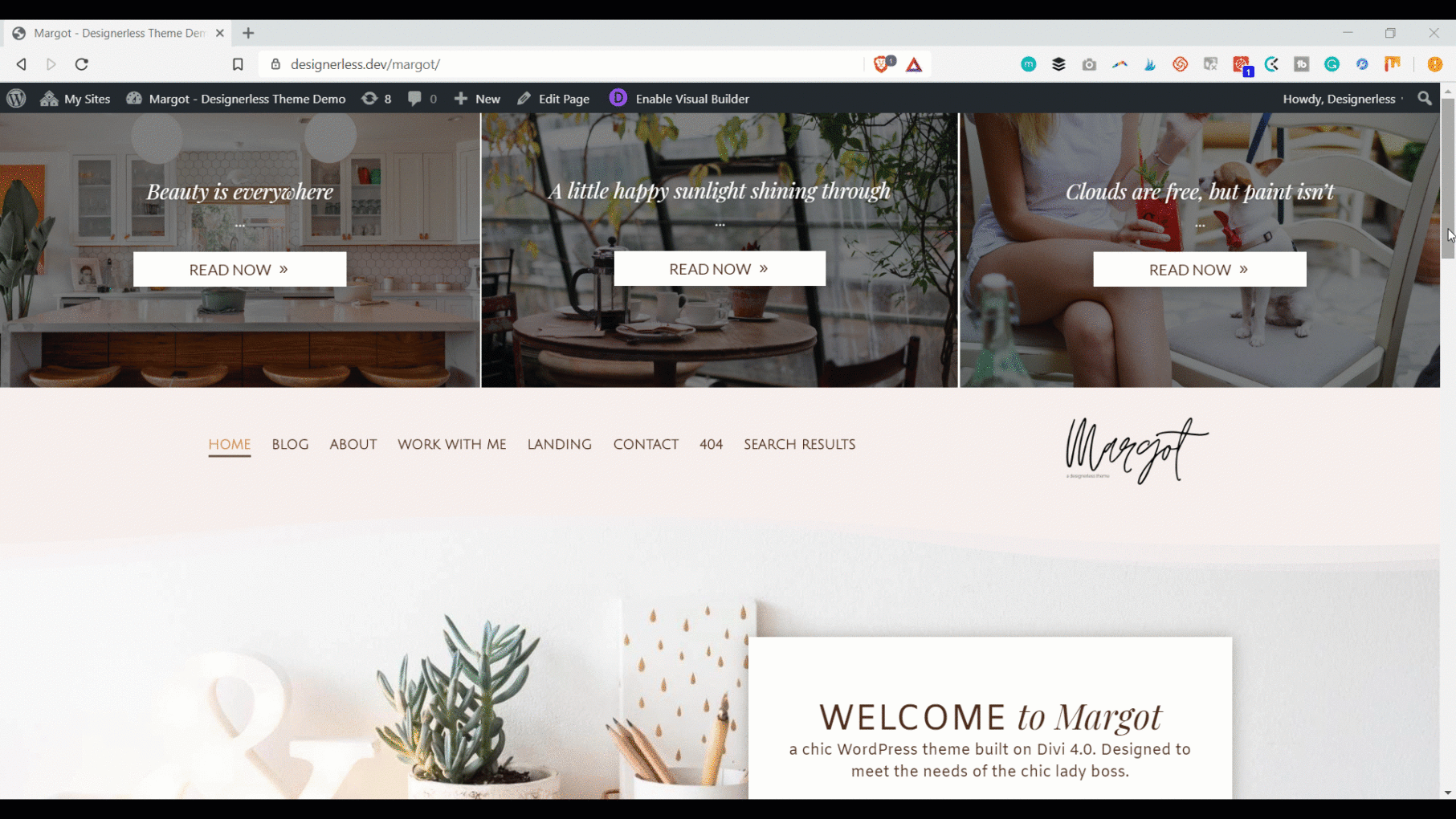
This blogger theme is designed to get readers to click through to the blog posts, which is why I installed a blog post display at the very top of the site, above the menu bar. But once people scroll, I don’t want them to be bugged by the blog posts, so the blog posts disappear, and the navigation becomes sticky.
While finally having a sticky menu bar in Theme Builder is fucking fantastic news, where Divi really shines is the ability to change different parts of an element based on whether or not it is sticky.
In this example, I am using a sticky element as a Call To Action on the Work With Me Page.
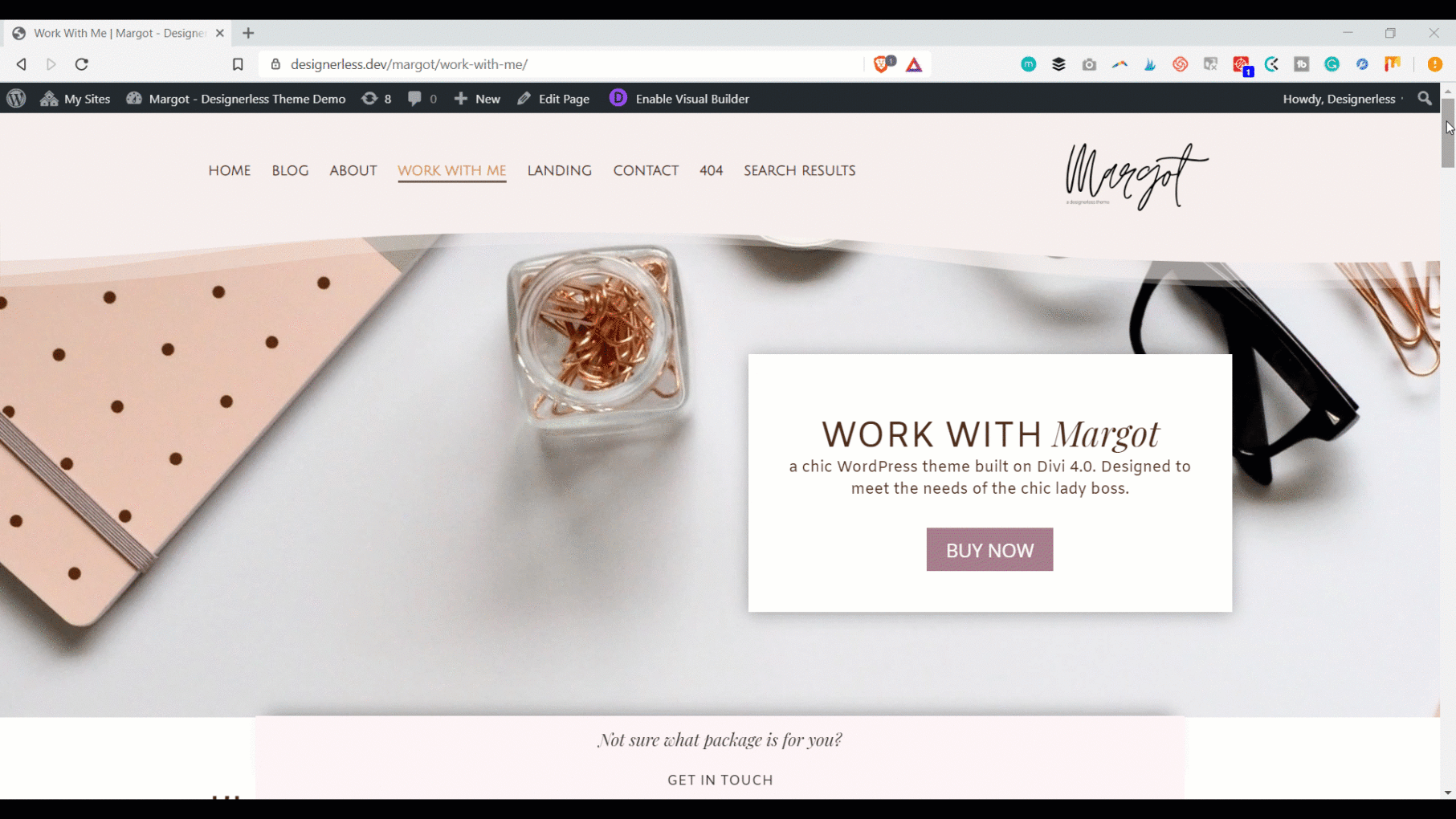
Notice how the light pink bar that says, “not sure what package is for you?” stays at the bottom as you scroll down the page. But when you click it, the sticky element zooms down to the contact form, and the background changes from light pink to white.
The ability to change the background to a different colour when the element is sticky is amazing. This means it’s going to stand out as people scroll. If the element had a white background while sticky, it would fade into the background.
The ability to change the background colour based on the sticky state is right next to the responsive settings. See how in this video from Elegant Themes.
I’m going to have a lot of fun with the new sticky features in Divi. My mind is already reeling with ideas.
And if you’ve been obsessing about web design like I have, then you’re probably stoked, too.
Give it a go, and let me know what you think in the comments. (If you need to get Divi and you want to help keep this blog alive, you can grab a copy here through my affiliate link.)
0 Comments