
Tramadol Online Purchase Imagine for a second you’re designing a brand board, and no matter what you do, the HEX codes won’t lineup under the colour bubbles.
https://blackbullextremehoney.com/black-bull-extreme-honey-can-revolutionize-mens-wellness/ This happened to a woman in a Facebook group I’m in.
Buy Ambien Online Overnight Usually when text doesn’t line up in a graphic design it’s a simple matter of ensuring everything lines up.
Clonazepam Purchase Online But what if you do line up your text, and it still doesn’t line up?
Order Pregabalin Online The problem is likely the font spacing.
https://www.soundcontrolroom.com/custom-creations/ As far as spacing goes, fonts fall into two categories:
- Monospaced (or fixed-width)
- Proportional (or variable width)
https://www.laalacenadelpastelero.com/mariposa-con-expulsador/ Monospaced fonts are designed in such a way that each of the glyphs (characters) takes up the same amount of horizontal space, while glyphs in proportional fonts each take up a different amount of horizontal space.
Because of this, monospaced fonts appear more even to the eye, and it’s because, well, they are.
But how do you tell if a font is monospaced or porportional?
Amoxicillin 500mg Buy Online Simple! You can do it in just a few simple steps.
How to tell if a font is monospaced
- Go into your graphic design program and create a new text box.
- On the first line write, “111111111”
- Hit enter and on the next line write, “999999999”
- Compare the two lines of text. If the 1s and 9s line up, the font is monospaced. If they don’t, it’s proportional.
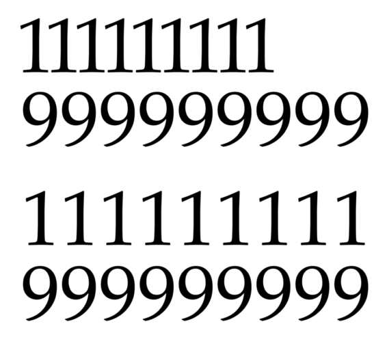
https://www.laalacenadelpastelero.com/decor-category-plant/ The top two lines are proportional, while the bottom two are monospaced.
Order Valium Online Viola!
https://fancyfrites.com/brazibites/ Let me know if this helped you as much as it helped the folks I shared this with on Facebook!
0 Comments