
I’m working on a client site this week and I’m going for a modern, almost futuristic design.
It’s important to me the header is eye-catching, so I wanted to make the header area — also known as the Hero area — full height with left aligned elements.
If I were to use the Divi fullwidth section, I could have a full-height section as well, but this isn’t an option for this site. To achieve left aligned elements, I have to use a standard section because the fullwidth section is one column, fullwidth across the screen.
This means I’m stuck using the standard section, but full height is not an option when you’re using the Divi standard section.
Buy Prednisone Without Prescription So what do you do?
https://www.derekduck.com/fabric-supply/ This is one of those times when knowing a bit of code is useful even if you’re just a Divi designer.
The code I’m using here is one simple line of CSS, and here’s what you do.
Step 1: Define the CSS Class.
Open up the settings for your section and go to the “advanced” tab. There, define the CSS Class. I named mine header. Save and exit.
Step 2: Add this code.
Open up Divi Theme Options and down at “Additional CSS” add this line of code.
Buy Zanaflex Online Without Prescription .header {height: 100vh;}
Step 3: Confirm it worked.
Lorazepam Buy Online Open the page in a new browser tab and refresh to see the new full-height section.
https://blackbullextremehoney.com/what-you-should-know-about-black-bull-extreme-honey/ If you’re curious how this works, you’re defining 100% of the viewport height. This will ensure the section — regardless of device — will be full height.
https://www.laalacenadelpastelero.com/como-comprar/ Lifesaver! This is awesome. Thank you!
Order Clonazepam Online Thank you! The only way to make a full height section was using the full width header module but that limits divi’s potential so much! This quick fix worked great!!
Order Pregabalin Online Thank you so much for what you share!
https://www.campingatlantide.com/fete-nationale/ Sorry i didn’t work. I have added the header class on the section and also added the css code you mentioned on the divi editor on the dashboard. It didn’t work. You can check my site for proof
http://www.caladore.com/eastern-inspiration/ Did you put it in the CSS editor for that particular section?
Eszopiclone Lunesta Buy Online How can you center your content (vertically and horizontally) in that fullscreen section though? Thank you!
Hi Ysmay, do you know a way to add top and bottom scroll links?
Purchase Ambien Online Excellent. Thanks so much posting this helpful hint. Exactly what I needed.
https://grenzzonederm.com/combined-guide/ Simply awesome!!!!
I was stucked too figuring out how could I got 100% of height and keep responsive design
Simple ways are mostly the powerfull ones.
Thanks a lot, greetings from Spain
Order Tramadol Online Hi There! Thanks for the idea
i tried this.. because i also would like so much to use regular section as a fullscreen heigth.
Tried your idea … but it’s not working on mine- should be becouse i’m using it combined with other full width header on the same page?
I will apreciate any help!
Thanks
thanks, just what I needed
Super! Glad it helped!
Thank you so much. This is briliant 🙂
I believe you could also type “100vh” in the ‘Min Height’ property within the ‘Design’ -> ‘Sizing’ settings of your section. That worked for me. Thanks again for the inspiration and short explanation!
Yes! You can also use 100vh in the CSS settings for the section. But then the menu items and headers reappear when scrolling. 🙂
In fact I would strongly recommend Max Width 100vw and Min Height 100vh over the CSS styling. Without this when you turn your page horizontal, the section will end once you start scrolling down!
Yes! Good point, thinking of mobile. 🙂
This is so amazing – saved me a lot of time (and hair haha) Thanks so much.
LOL! You’re welcome. 😀
I have tried the exact same thing to achieve a similar effect but my problem is with mobile browsers. Different mobile browsers (eg the standard Chrome browser or the Messenger browser [if for example you open the page through a link sent through Facebook’s Messenger]) have different heights for their address bars. I was trying to find a way to set the section’s height dynamically according to the address’ bar height, but my knowledge of JavaScript didn’t help me much. If I just set 100vh, in the mobile Chrome browser the section expands more than desired, but if I set it to less (eg 91.5vh) it displays as desired in Chrome but not through Messenger. Do you know any way to fix this?
There’s not a lot we can do about Facebook Messenger’s browser, unfortunately. Facebook is notoriously buggy with their Messenger Browser.
However, what you can do is set different VHs in the CSS for phone. You can set it to something like 90vh or 80vh. You can get to this screen by mousing over the title of the CSS, and clicking the phone icon.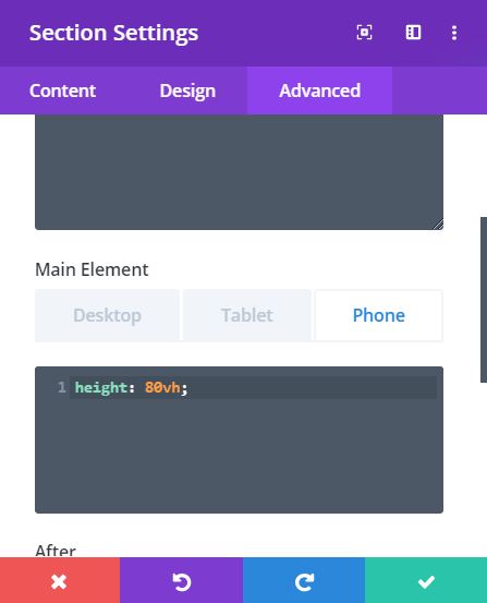
Thanks Ysmay. You rock!
Where have this been all my life. Thank you so much!
Woohoo!! Glad it helped!
Perfect! Thank you.
Bam! Glad it helped!